Pantone Color of the Year 2017 and How to Use It When Selling or Staging a Home
Every year, the color company Pantone picks a Color of the Year that they feel best represents the mood for the coming months ahead. As could be expected, their picks tend to greatly affect related industries such as graphic design, fashion, architecture, and perhaps the one most closely related to real estate, interior design.
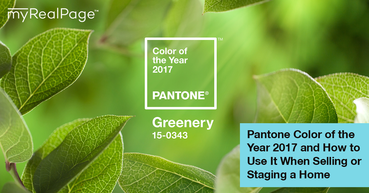
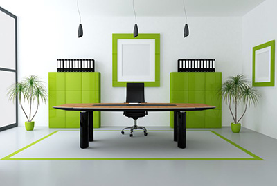
For 2017, that color is called “Greenery” (Pantone 15-0343) and is described as a hue that evokes themes such as rejuvenation and freshness. It is the color of spring, and new leaves, and is also associated with reinvigoration, as well as a return to nature.
However, Greenery is a vibrant shade that may not be for everyone, so don’t go repainting an entire home in this color just yet. It’s important to keep in mind that color tends to affect buyers’ attitudes, so making smart color choices when presenting a home can be crucial.
Instead, here are some practical ways that you can put this color to use when renovating and/or staging a home that you are planning to sell, while still injecting the dose of vigor that this color represents.
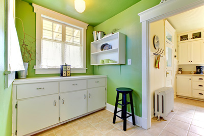
Accent Walls
Though we once again caution you about going overboard with this color, having an accent wall (a.k.a., that one wall in the room that is colored differently) in one of the rooms of the house may prove to be a delightful addition – provided it also jives well with the rest of the house, of course! Painting one wall of the room in Greenery can give it an especially refreshing look, whether it be the living room, a guest bedroom, a nursery or child’s room, or even the laundry room.
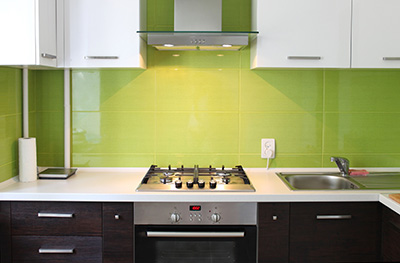
Cabinets and Splashbacks
Tired of the white, gray, beige, taupe, brown, etc. landscape that is the kitchen or bathroom? Break the monotony, and consider repainting cabinetry, shelves, or drawers in Greenery to give a nice, lively “pop” against the neutral background.
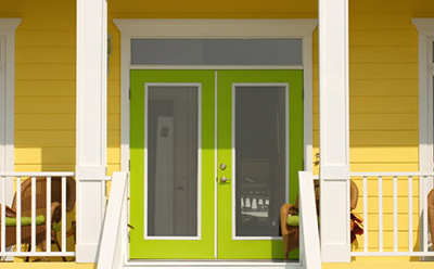
Door and Window Trims
As with cabinetry, door and window trims are also great spots to apply this lovely color, giving it an opportunity to stand out within an area that is most likely dominated by wide areas of other neutral colors. If you’re feeling a little brave, you can also try painting the door itself and/or the window shutters in this color.
Accent Furniture and Accessories
For the more conservative types, the safest bet would most likely be to add interesting pieces of furniture that come in this color. You can also try sprinkling around small accessories throughout the room that are of a similar shade in order to tie everything together a little better.
These are just a few of the many ways that Pantone’s Color of the Year for 2017 can be used within a home or property. Just remember to try to mix and match it with other shades of green as well as neutral colors, and you should be able to achieve a look that any home buyer would fall in love with.