From Listings to Leads: Design a Realtor Website That Converts

Being a realtor is a very rewarding profession. You have a flexible schedule, you’re helping people find their dream homes, and it can pay well.
But because of this, there’s a lot of competition.
In Toronto alone there are 73,000 licensed realtors. If you’re trying to sell a house, that’s great news. But if you’re a Toronto realtor, that’s a pain in the ass.
So you need to find a way to get a competitive edge.
The obvious thing to do is to spread vicious rumours about all 72,999 of your competitors. But that’s going to take a while, so we’ll need a Plan B.
That’s where your website comes in.
To most realtors, a website is a thing they have, but don’t do anything with. Often they just use the basic website handed to them by their brokerage. Or they use something like Wix or Squarespace which aren’t designed for realtors.
That’s if they have a website at all.
This creates a huge opportunity for any realtor who takes their website seriously. And in this post, I’ll show you exactly how to do just that.
We’re going to walk through what makes a great realtor website, and how you can achieve this quickly and affordably. It doesn’t matter if you’re doing this full-time, or as a secondary income.
Let’s dive in!
Step 1 – Make your website look great
Have you ever clicked on a link, looked at a website, and immediately thought “NOPE!!!”? If you haven’t – your customers have.
Sometimes it’s the color scheme, sometimes it’s a creepy grin in a photo, and sometimes it looks like the website was made circa 1998.
Whatever it is, it’s important to not give potential customers this feeling.
Your website is likely a key part of the process when someone is deciding whether to hire you or not. So you need to make the best impression possible.
This is even backed up by science. According to a study by Standford University, 75% of people judge the credibility of a company based on the design of its website.
Your website should be bright, modern, professional, and clearly represent your services.

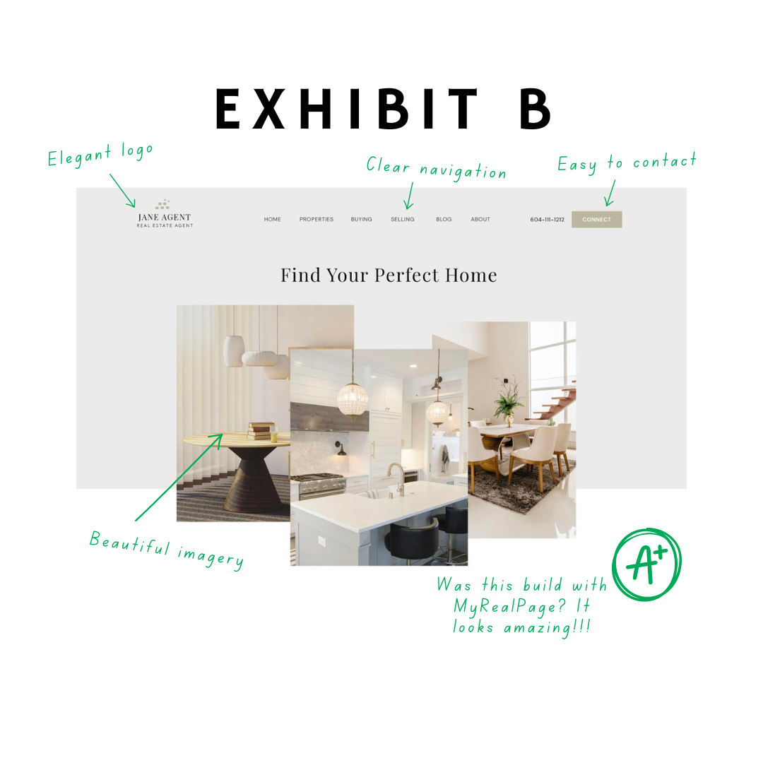
Step 2 – Show off your beautiful listings
What’s the point in having a website if you can’t show off your listings?
A great realtor website is a showcase of all the properties available, where people can search by location, filter, sort, and even view where the properties are on a map.
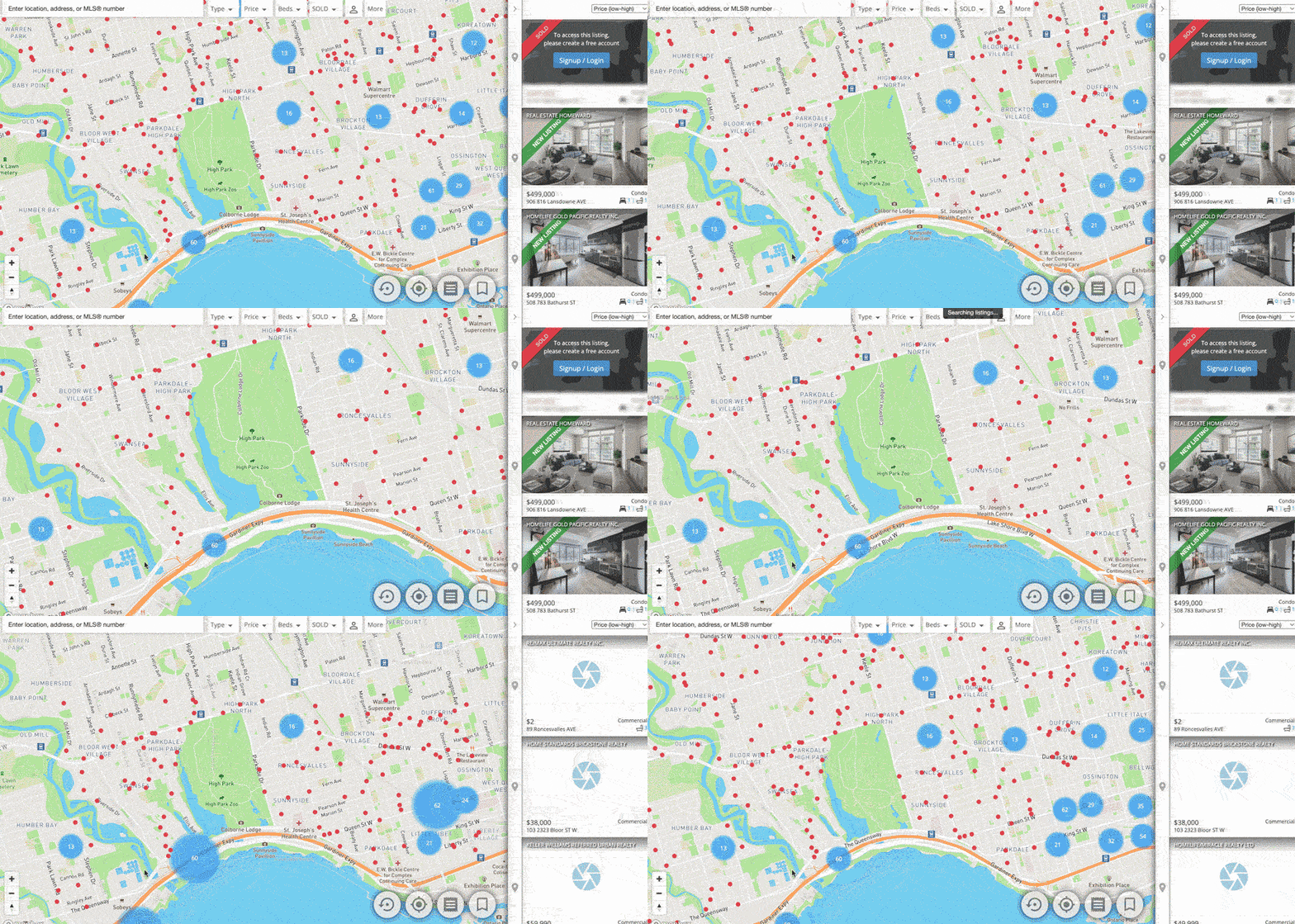
Your listings should look great, including photos, description, floorplan, etc. And you need to be able to add banners like “Sold” and “New Listing” to make sure your listings are honest and up to date.
It should essentially be your personal REALTOR.ca, but without those pesky competitors taking up space. Don’t you think?
Well, we did think., myRealPage makes it really easy to add listings with our built-in automated listing tools. It looks great, too! If you don’t believe me, check out the screenshot below
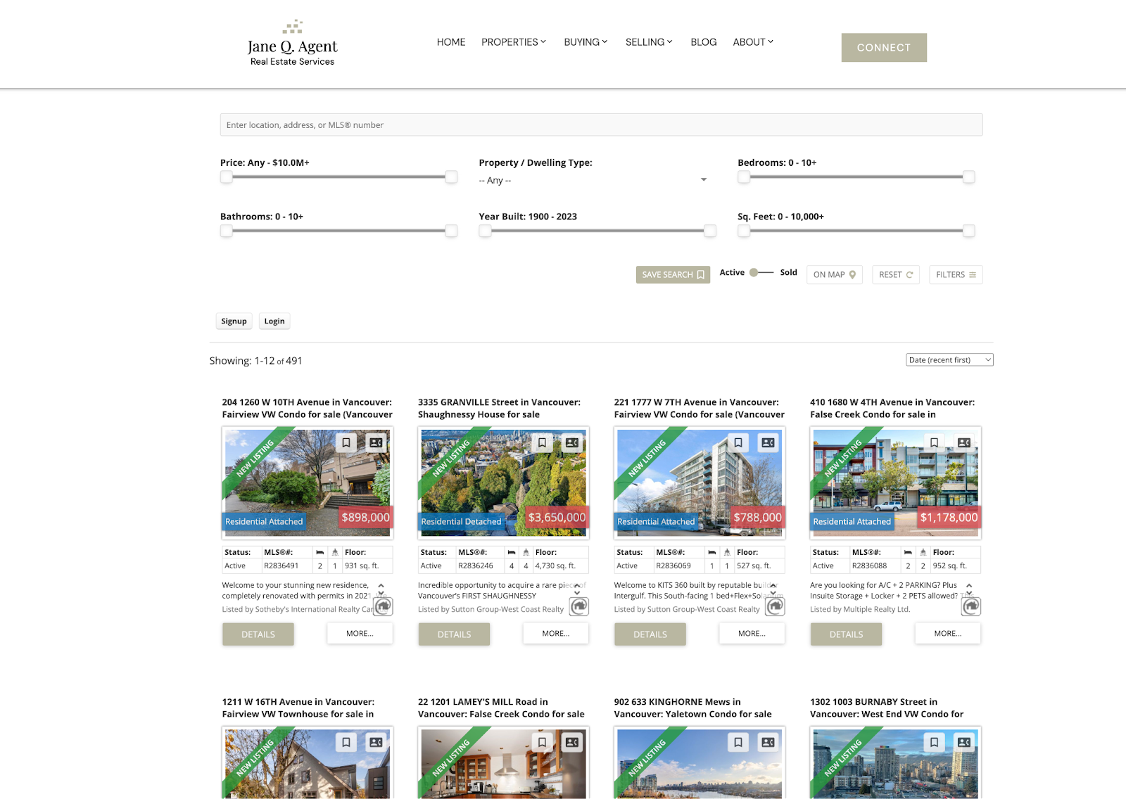
You wouldn’t believe how simple it is to create a listings page like the one above. And how GOOD does it look? Honesty – this is better than what most aggregators look like, but it’s yours! Not REALTOR.ca, not Zillow — yours!
Step 3 – Capture all the leads
Website, HUH! Good God, y’all…what is it good for?
Getting leads. That’s what!
Your website is a billboard, and a billboard needs a call to action. Your customers need a way to get in touch with you that’s easy and convenient.
Whether they want to hire you, enquire about a property, or sign up for your newsletter, you need to make it obvious how they do that.
The best way to do this is with lead capture forms, which can be accessed wherever is appropriate. For example, you’ll want to include an inquiry/viewing booking form on your listings. This way it’s really easy for potential buyers to get in touch with you.
Here’s how a form made with myRealPage looks:

Look, we’re not saying you have to use myRealPage, but it’s hard to deny that if you do, you’ll be able to capture leads through a professional looking lead generation form that puts you heads and shoulders above your competition.
When someone is at the point of contacting you, that’s when they’re at their most impressionable. Do you want them filling in some crummy form and have no idea if it’s going to disappear into the ether of junk mail, or know that they’re dealing with a professional outfit?
But what about your own priorities – do you have the time, skills and desire to learn how to setup a 3rd party add-on, style and publish and feel confident it’s a) safe and b) always going to be accessible? We don’t think you do – that’s why we made ours super easy and handle everything for you.
Step 4 – Be in full control of your professional image
Want to tweak your landing page, add a video to your About page, or start promoting your newsletter?
You shouldn’t have to pay through the nose for a developer to make those changes in three weeks.
By using a powerful website editor, you can make the changes you need on the fly. No more waiting around or being charged a fortune. You can just log in, make the change easily, and hit publish.
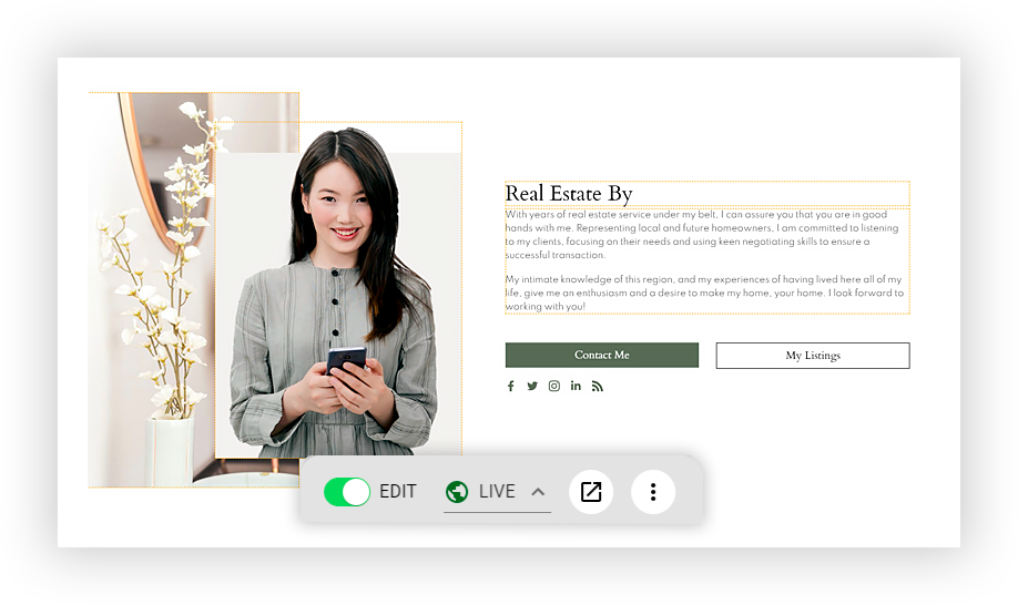
This kind of agility is a huge benefit for realtors because you can evolve and expand your website as and when you need it. This is invaluable in such a fast-changing industry.
Step 5 – Set it and forget it
Just because you can make changes to your website, it doesn’t mean you should have to. In fact, once you’ve got your site set up, you should be able to leave it to do its thing.
There are certain website builders (*ahem* WordPress *ahem*) that require you to constantly log in to update plugins, check settings, and review changes. This is a huge waste of time, especially when you’ve got much more important things to be doing with your time.
Set and forget means your website is working for you, not the other way around.
Step 6 – Use the tool that ticks all these boxes
You now know how to get the advantage over your realtor competitors, but you probably have one question left:
Is there a tool that will do all this for me?
Lucky for you, the answer is a big and resounding YES!
We built myRealPage because we didn’t want just another website builder. We wanted to build a real estate website builder that specifically helped realtors solve the unique problems they face.
- Our new website editor gives you everything you need to build the website of your dreams, and easily tweak and change it whenever you want
- The automated listing tool was created so you can display your listings the way you want to with minimal fuss, including a map view and advanced search.
- The listing tool also has lead capture features, so you can gather the information you need from your prospective buyers. You can also create custom contact forms and newsletter signup forms.
- Our selection of real estate website templates makes it super simple to create a great-looking website, without needing to hire a designer to build it from scratch.
- myRealPage is designed to require minimal upkeep, so you can just set it and forget it
What you should do now?
- Sign up to myRealPage now and get three months free
- Receive our latest marketing articles straight to your inbox by subscribing to our newsletter
- Know someone who needs to level up their realtor website? Share this on LinkedIn or email.
Last Updated on November 18, 2024 by myRealPage
