Revamp Your Real Estate Website With These Website Design Trends

Feeling like your website could use some sprucing up but are intimidated by the process?
Skip the complete overhaul and go for a refresh instead.
Like a good haircut or a new pair of glasses, sometimes a few cosmetic changes are all you need to make your website feel shiny and new.
For a makeover that really impresses your visitors and wows potential clients, use these 2023 website design trends to revamp your real estate website.
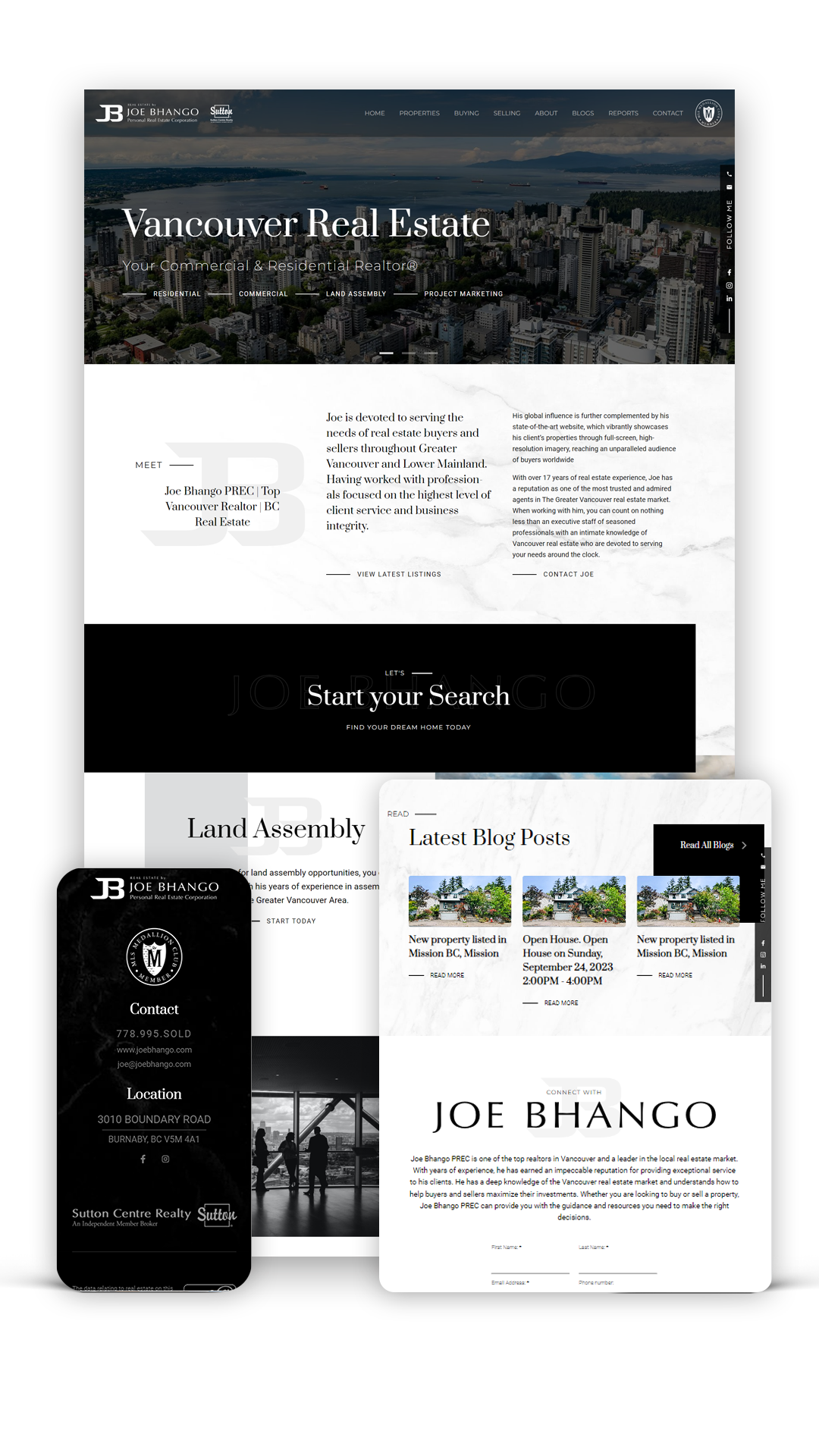
Strong Typography
This trend is all about unique fonts (or standard fonts applied in bold ways) used sparingly but strategically.
It creates a striking first impression and guides users to what they should be looking at first. The effect is bold and cool, but not overpowering.
How to apply it to your real estate website:
If you use the same font family as a part of your real estate branding, there’s no need to throw it out. Instead, choose one bold font to use for page titles throughout your site. Increase the size of those titles so they feel nearly oversized — your goal is to create impact!
For an additional touch, choose a special font specifically for your business name. It makes your name pop and is a great way to take your branding up a notch.

Minimalism
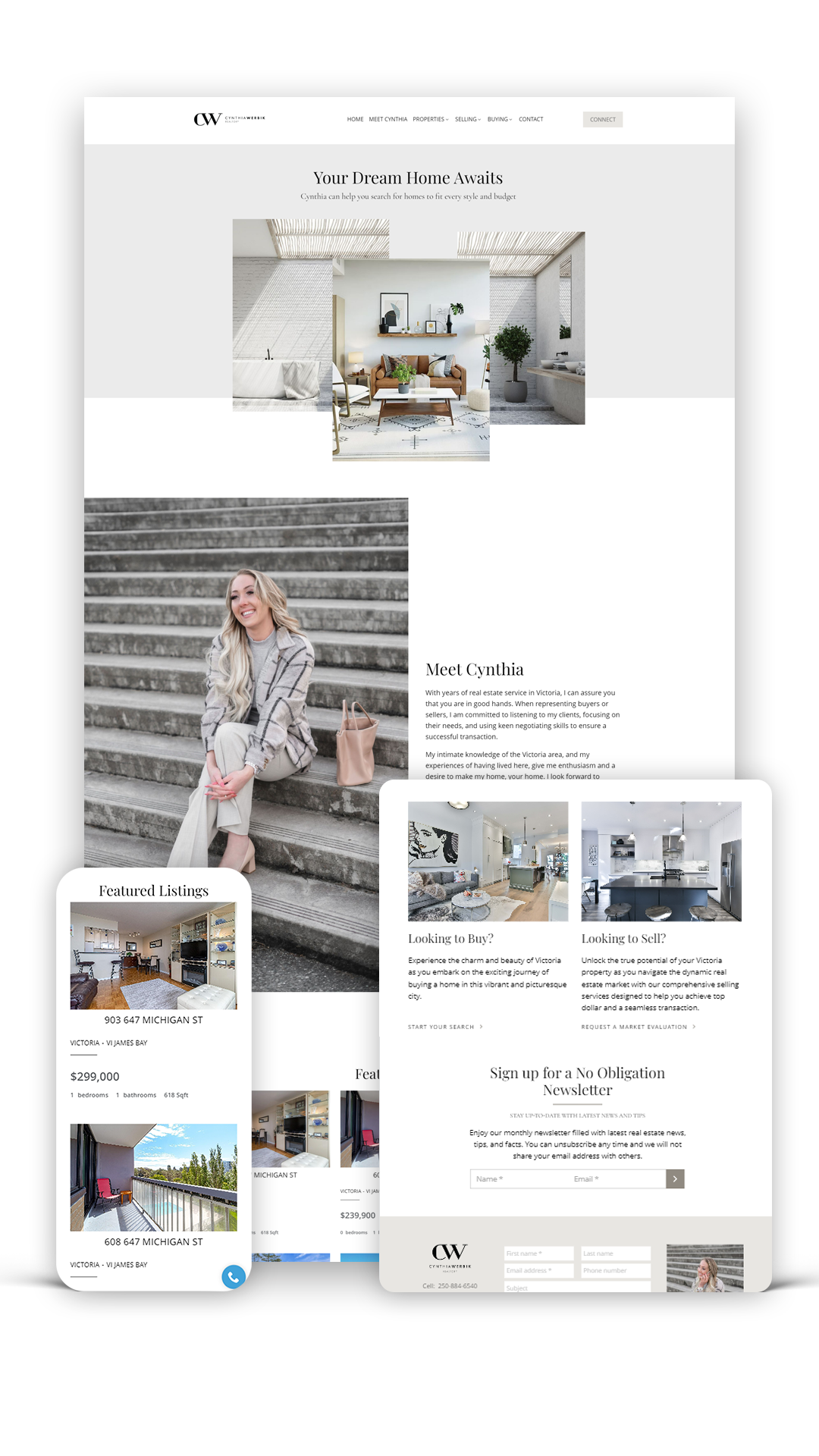
If funky fonts aren’t your vibe, perhaps minimalism is.
A minimalist website aesthetic pares back all design elements — think less colour, simpler typography, fewer graphics, clean lines and plenty of white space.
Done well, a minimalist website feels modern and elegant. It creates lots of breathing room that lets your copy and photos pop.
How to apply it to your real estate website:
Pare back, but strategically.
Could your website copy be more concise without sacrificing important information? Are there design elements, such as borders, text boxes and decorative flourishes, that could be removed?
You can try splitting up larger paragraphs into smaller ones to create more white space, and swap out several images on a page in favour of one larger photo. If your colour palette includes three or more colours, reduce it to two.

Animated Elements
Elements that are “alive” — GIFs, short looped videos, animated illustrations, moving cursors, interactive design and so on — are a trending way to make a website feel dynamic.
If that brings to mind websites from the early aughts, where websites flashed, zoomed and played music, you’re not entirely off base. There are some hints of Y2K nostalgia to this trend.
Don’t let that scare you. Animated elements can be incorporated in a myriad of ways, with a heavy hand or light touch, and to serve a variety of purposes.
How to apply it to your real estate website:
Leave the complicated animations to the creative industries; for real estate agents, the best way to tap into this trend is to use animated elements to create emphasis or illustrate a point.
That could look like:
- Using a animated squiggle to underline a call-to-action
- Commissioning an illustrator to create an animated illustration that explains a housing market concept, or even the history of your business
- Replacing static cover images or thumbnails (for things like downloadable resources or other hyperlinked content) with simple GIFs or animated icons
Organic Shapes
One of the simplest ways to add some visual personality to your real estate website this year is to think out of the box. Literally.
This trend is about swapping out hard lines and rigid boxes for squiggles, ovals and soft edges.
That can look like editing photos to have rounded frames instead of square or rectangular borders. The same thing can be done for text boxes.
Using organic shapes can make your website look friendly and add a touch of playfulness, plus has the added bonus of feeling fresh and cool.
How to apply it to your real estate website:
The easiest way is the application mentioned above — using rounded boxes and frames for text and photos.
Applying it to every part of your website will be difficult and will likely feel like overkill, so start small. Most photo editors have options for adding circular or oval frames to your images. Try using one for your headshot and adding it to your “About Me” page on your website.
Other Ways to Refresh Your Real Estate Website
If you’re looking to improve your real estate website without tinkering with the aesthetics, check out these ideas:
- Create new real estate landing pages to capture leads
- Get a brand new website with real estate website myRealPage and with a 50% Off discount for the first 3 months!
- Work your way through this list of 10 easy real estate website improvements
- Incorporate sold listing data
- Revisit your strategy for generating real estate agent website traffic
- Write a new realtor “About Me” page
Last Updated on June 3, 2024 by myRealPage


