5 Tips For Creating Standout Real Estate Business Cards

We talk a lot on this blog about social media tips for real estate agents and how to improve your real estate website.
Today, we’re taking it offline. Literally.
We’re discussing a part of real estate business that the internet hasn’t replaced — the good old-fashioned business card.
Business cards aren’t going anywhere.
Pulling out your phone to show a new connection a digitized version of your card is nowhere near as effective as handing them that small rectangular piece of cardstock that they can slip into their wallet.
You’ve probably had a business card for as long as you’ve been in the industry. But when was the last time you updated it?
If your answer is “never” or “five years ago” or “I don’t have a business card,” then this post is for you.
Here’s how to create effective real estate business cards that stand out from the crowd.
1. Keep It Simple
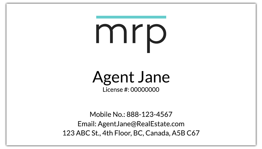
Just because you have the option to add text effects, graphics and fancy finishes doesn’t mean you should use them. Your card should feel tasteful, modern and approachable — like the real estate agent you are.
They say, don’t trust a hairdresser with a bad hairdo. Would you trust a professional’s taste if the card looks messy, busy and overdone?
Here’s what to avoid:
- Too much text. People use business cards for contact information, not personal biographies. Stick to the necessities. More on this in a minute.
- Too much decoration. Don’t go overboard with embossing, holographic effects and photos.
- Too big (or small) fonts. Both are jarring. Always go with an 11- or 12-point font for the best legibility.

2. Include the Right Information
There’s so much you could say on your card; awards you’ve won, your sales numbers or your philosophy.
But that’s not what your business card is for. Your business card is a reference.
Use it to include:
- Your full name
- Your title (someone may take your card and later forget who you were; include REALTOR® below or beside your name)
- Your website
- Your email address
- Your office phone number
- Your cell phone number
- Your office address
- Your social media handles (optional; these can look unwieldy. Include only the one or two that you use faithfully and as a key business tool)
- Your slogan (optional, and only if it’s short and sweet)

3. Stick With White
This goes for the front and back of your card.
Avoid the temptation to stand out with a bright blue or neon orange card; dark-coloured text on a white background will always be the easiest to read.
White is also the easiest to write on. You may want to add a note before you give your card to someone or they may want to jot down additional information, such as a meeting time. Make it easy for them.

4. Don’t Skimp on Quality
 Sure, a flimsy cardstock will save you money. But it also looks and feels cheap, and rips and bends easily.
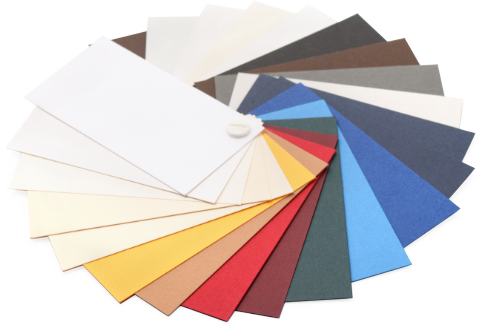
Spend the little bit extra on a thicker, higher quality cardstock. Go with a 14, 16 or 17 pt. stock for best results, and definitely with a 16 or 17 if you want your card to feel luxe.
If you want to spend a little extra, try a specialty paper. Most business card printers offer premium options with cool tactile effects such as cotton, silk and suede.
5. Add a Sprinkle of Personality
This doesn’t mean you can throw our other advice out the window. Simplicity is still your ultimate goal here. But there are ways you can add just a dash of pizzazz without distracting your reader:
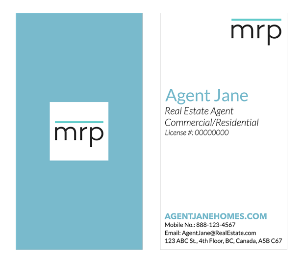
- Incorporate a secondary colour. Maybe use a punchier hue for your name. Or add a very fine coloured border at the card’s edge. Or put your telephone, email and social media icons in a different shade.
- Use a logo. If you already have a logo for your personal REALTOR® brand, consider placing it in the upper-left corner or preceding your name. Just scale it down so it doesn’t overwhelm your card.
- Hire a designer. Online print shops make it very easy to design and order your own cards. But if you want to go the extra mile, hire a graphic designer to create a card for you. The cost will depend on the designer you choose, of course, but business card designs do tend to be more affordable since the job is fairly small.
What’s the best business card you’ve ever received? What made it so memorable?
Last Updated on August 12, 2022 by myRealPage


